Chasing Corona
2020
Visualizing COVID-19 coronavirus impact and spread
Percentage of population that are confirmed cases
(First version: Feb 28, 2020)
The top 20 countries in terms of percentage of the population confirmed to be affected by the COVID-19 coronavirus are shown below1,
along with a world-wide average.
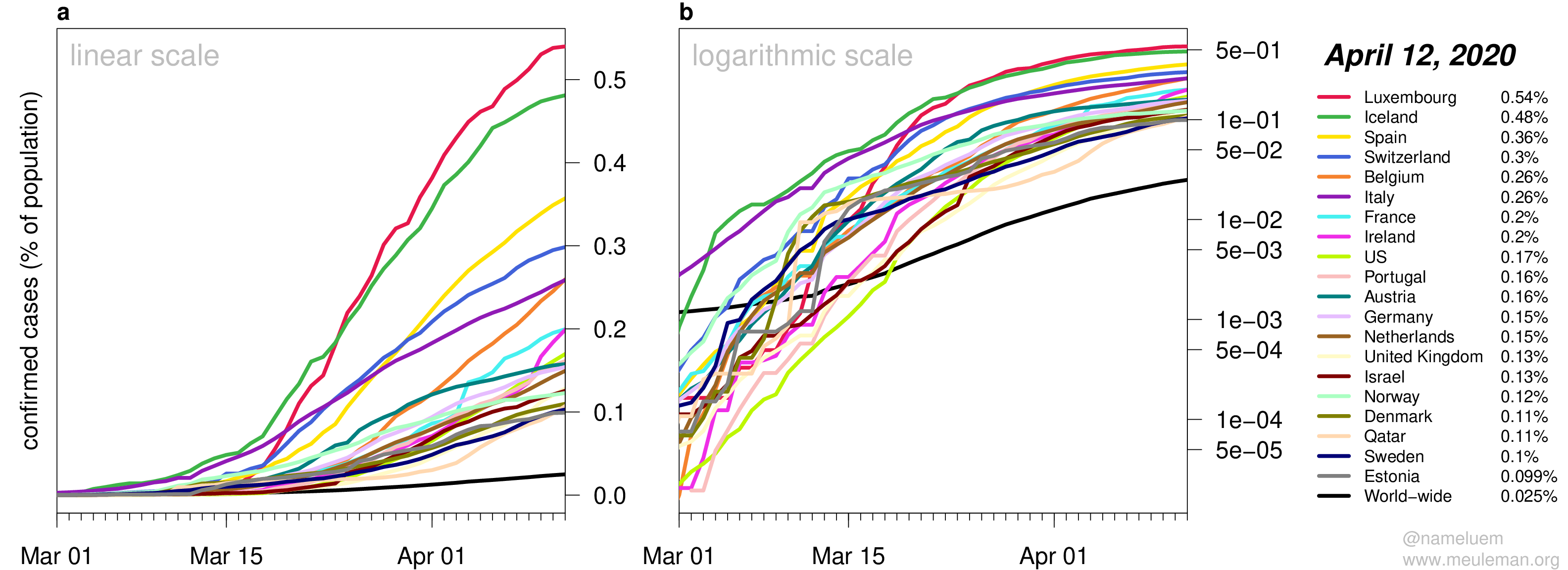
COVID-19 cases are severely underreported due to limited testing and as such these numbers are likely extreme underestimates.
Yet, the shape of these curves might provide meaningful information about different patterns of viral infection progression and containment between countries, in particular when multiple countries show similar patterns.
Daily growth of newly confirmed cases
(First version: Mar 12, 2020)
More relevant than the number of confirmed cases – or percentage of population affected – is how fast the virus spreads.
One way to visualize this is to estimate the slope of the exponential curves (Figure 1b) over set time intervals and derive the daily percental increase of newly confirmed cases2.
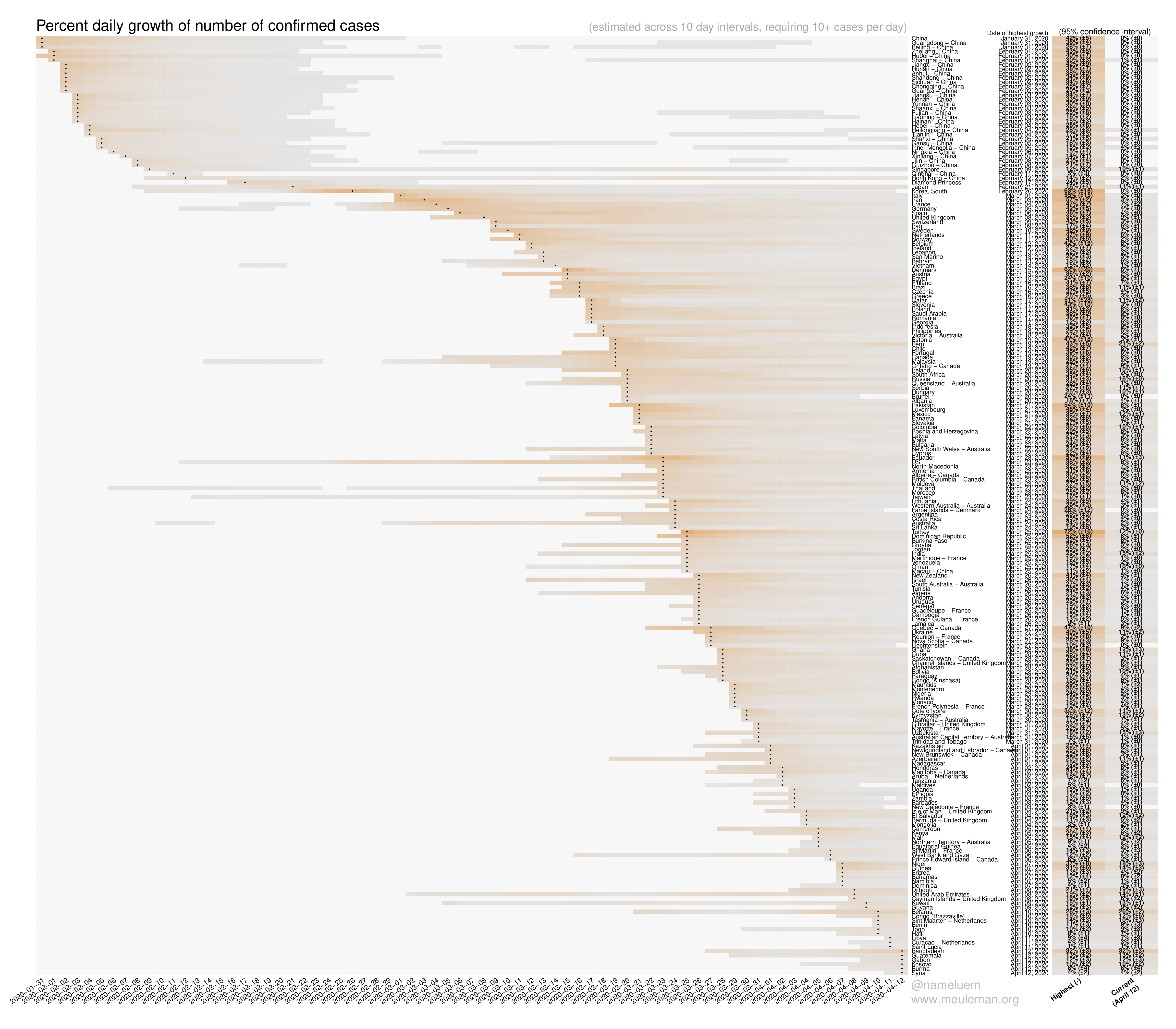
It is important to emphasize that over the course of time many countries have revised their testing strategies, which will artificially influence these growth numbers.
Percentage of population that has died of COVID-19
(First version: Mar 26, 2020)
By the end of March, the number of deaths from COVID-19 had risen to a level that
made it possible to show growth curves in a similar manner as done for confirmed cases above.
The number of deaths from COVID-19 is arguably a more reliable metric for population-wide impact,
as it suffers less from the absence of systematic and/or asymptomatic testing.
The top 20 countries in terms of percentage of the population that has died from of COVID-19 are shown below3,
along with a world-wide average.
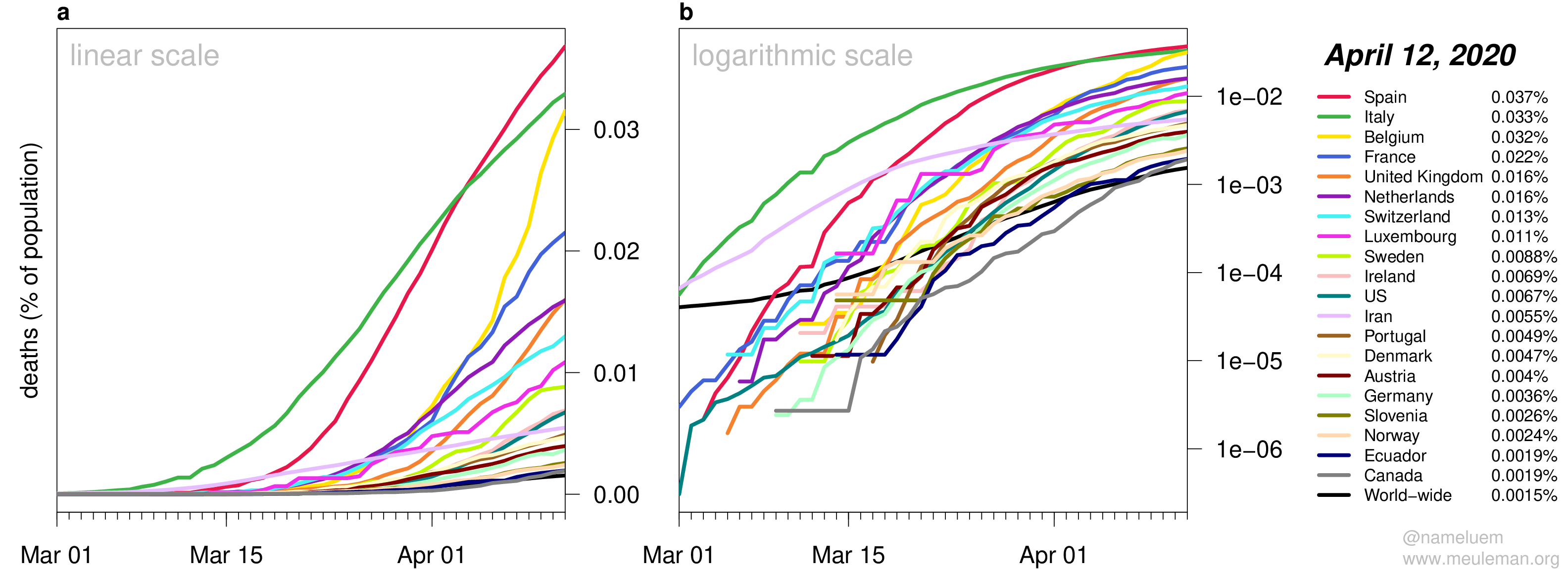
It’ll be interesting, and generally disheartening, to see how these figures evolve over the coming weeks and months.
More figures and details are available at this GitHub repository.
Background
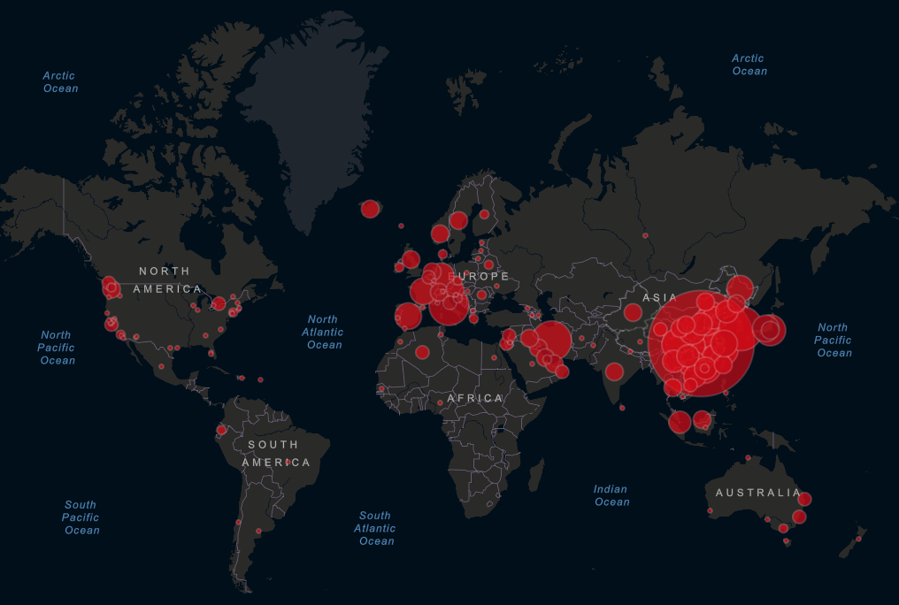
The outbreak of the COVID-19 corona virus prompted an impressively rapid and joint response of epidemiologists, geneticists, software developers and data analysts. This has resulted in a number of insightful web-based dashboard tools to track and better understand the movements of this virus for specific regions, countries and throughout the world4:
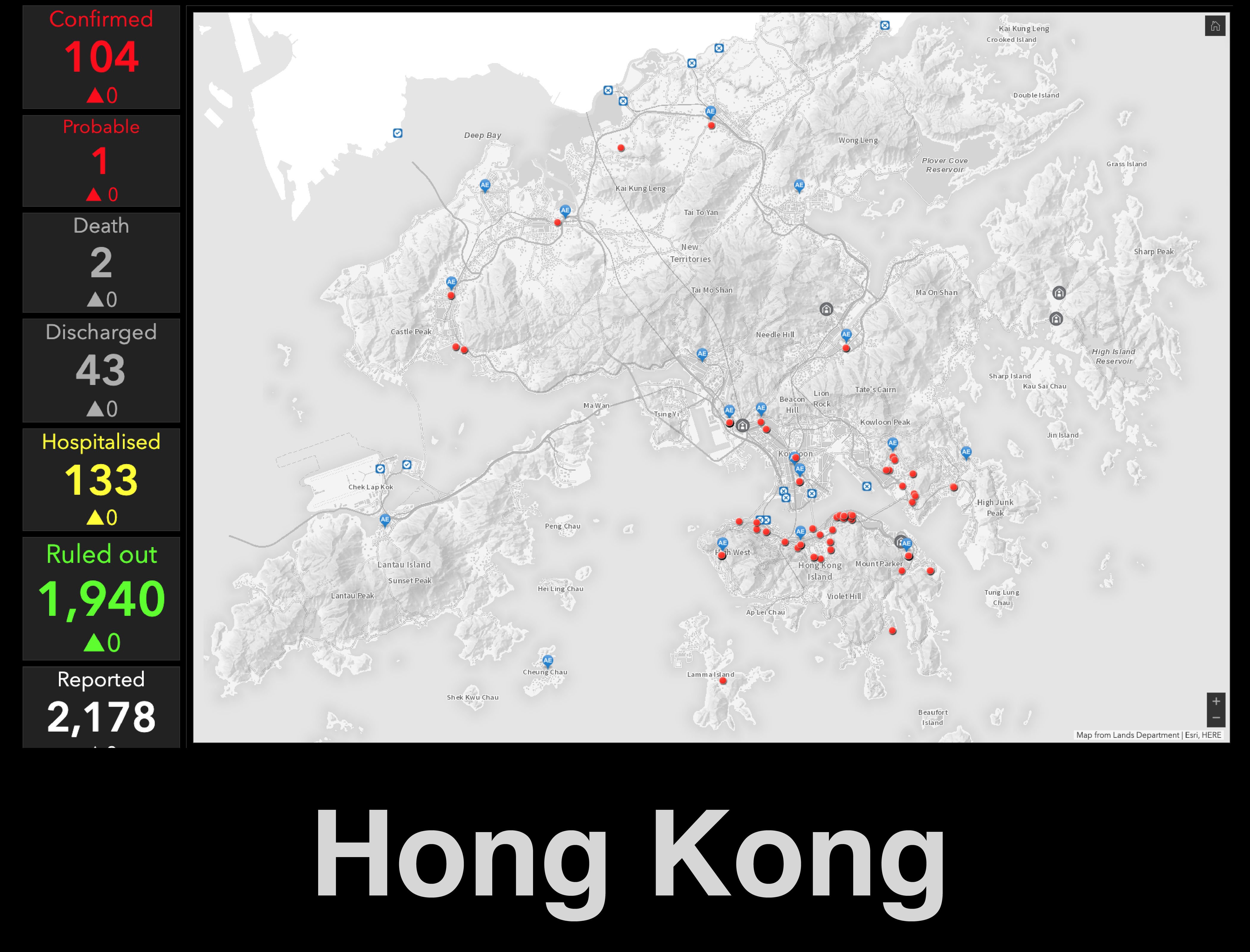
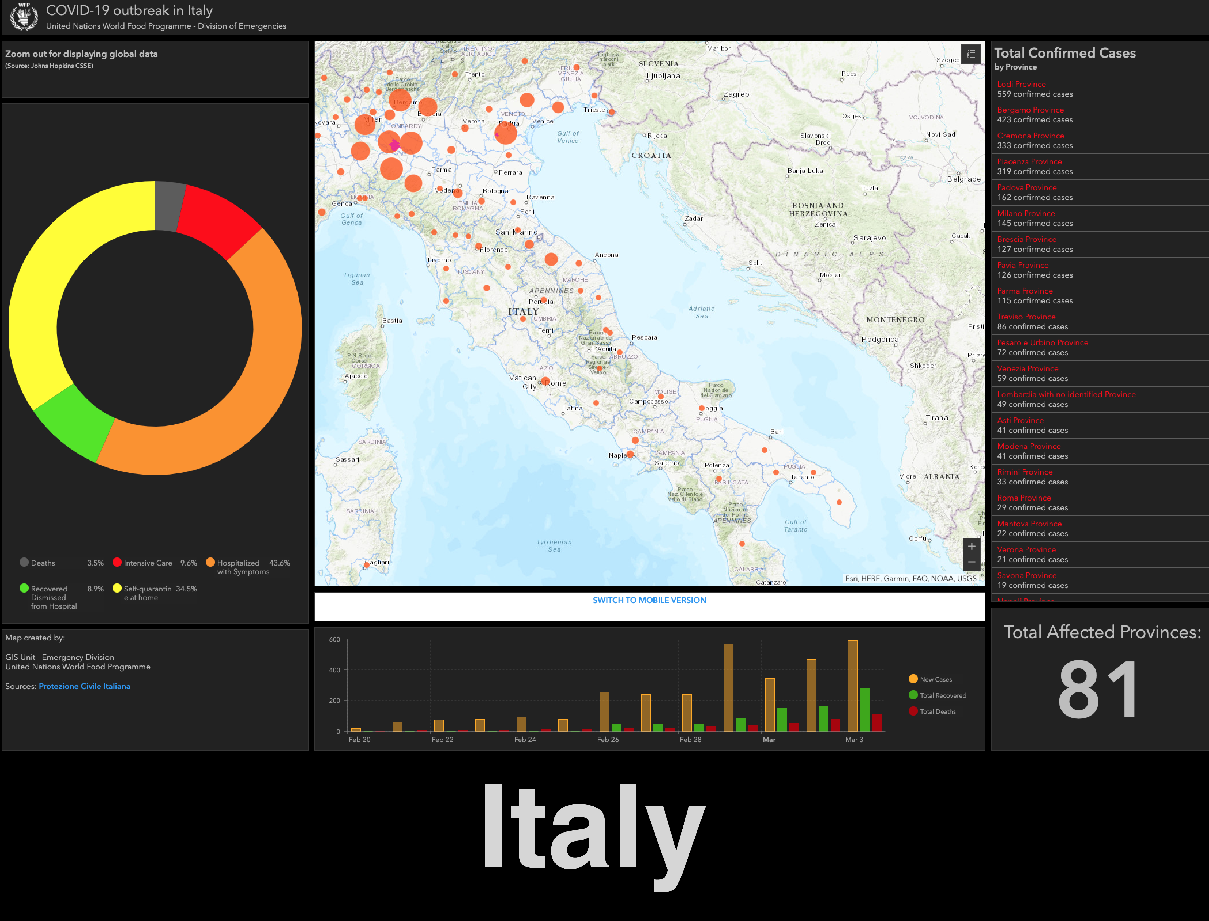
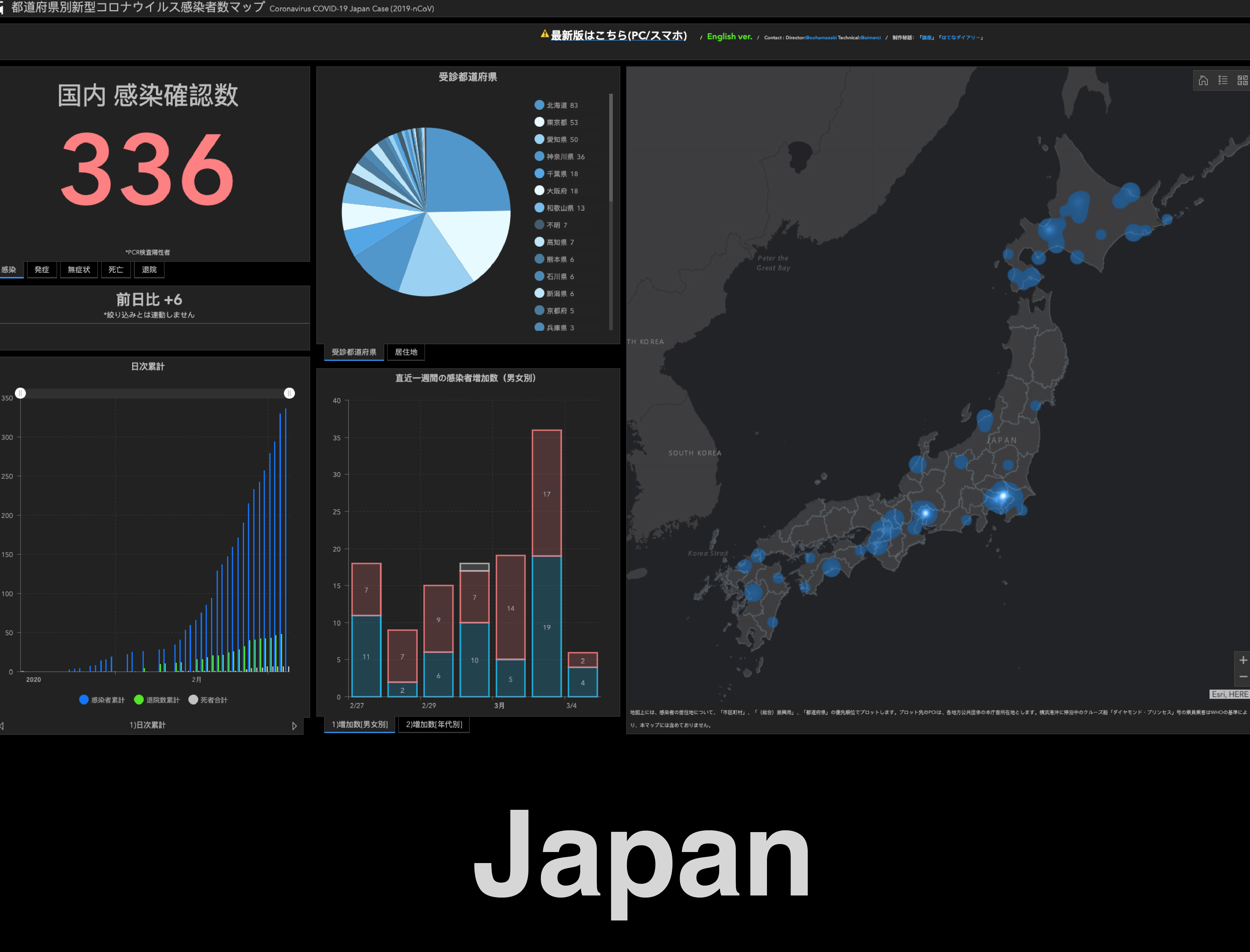
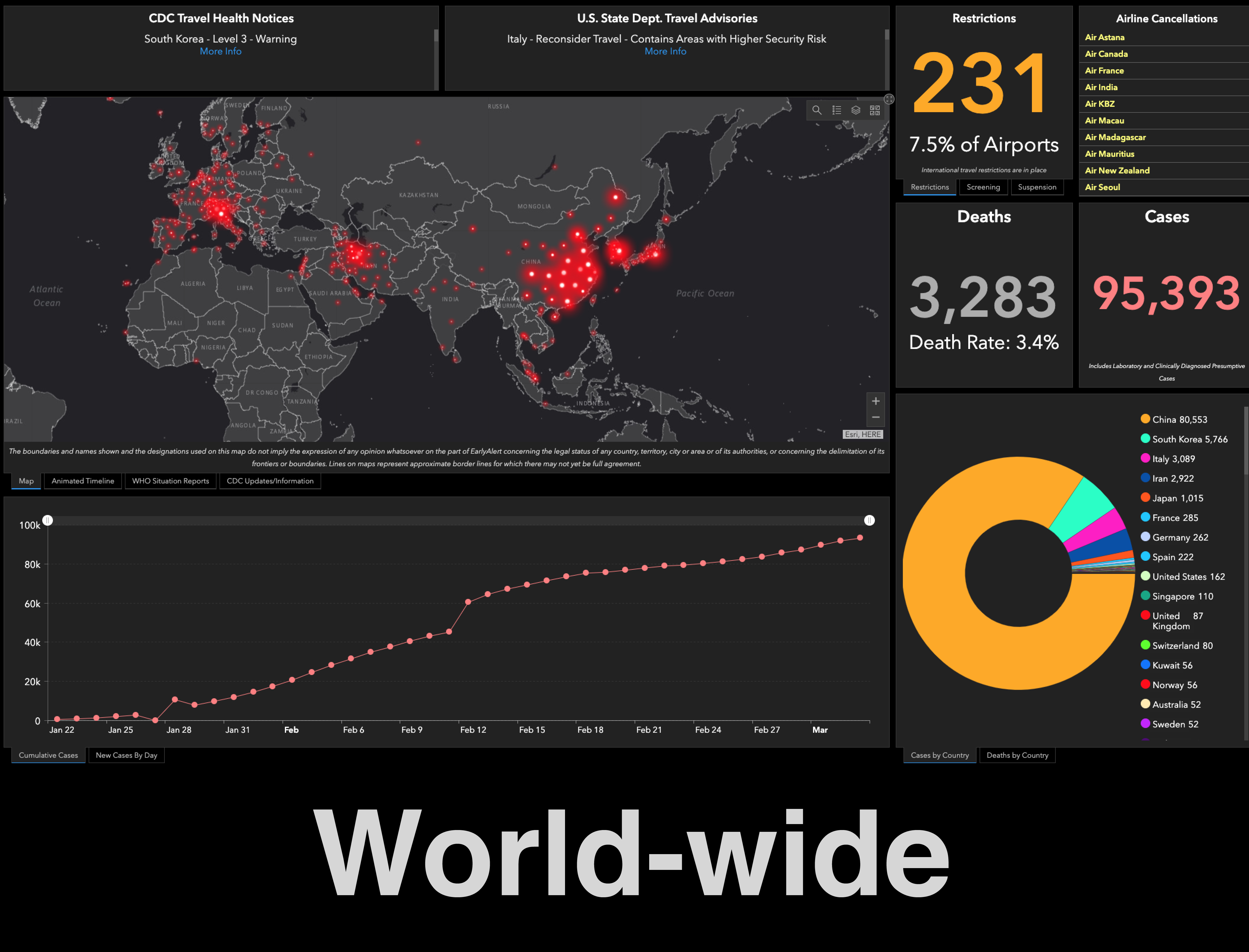
One of the more comprehensive instances in terms of world-wide coverage is a
dashboard
provided by Johns Hopkins University (JHU), displaying counts of confirmed cases, deaths and recoveries:
What struck me about these dashboards is that although they provide reports on the absolute number of cases identified – some even provide in-depth information on individual cases – they lack a population-wide context. In particular, I wanted to know what these numbers meant in terms of the fraction of (per-country) populations affected.
Approach
Normalizing the number of confirmed COVID-19 cases per country with per-country population estimates requires two things: 1) the numbers behind these dashboards and 2) estimates of per-country population counts.
Luckily the folks at JHU have freely made available their meticulously curated datasets, which they continue to update on a daily basis. And the World Bank provides population count estimates for over 250 countries world-wide.
Combined5, these datasets open up an alternative view of the COVID-19 situation, in terms of the percentage of per-country populations (confirmed to be) affected by the virus. All code, data and resulting figures are available through this GitHub repository, and are updated on a near-daily basis.
-
To prevent highly unstable percentages, currently included countries have a minimum of 100 cases and a population of at least 100000. ↩︎
-
Estimates are based on 10 day intervals. To prevent unstable estimates, data is only shown for periods in which there were more than 10 confirmed cases in a given country, over an entire 10 day interval. ↩︎
-
To prevent highly unstable percentages, currently included countries have a minimum of 25 deaths and a population of at least 100000. ↩︎
-
COVID-19 ArcGIS Hub: https://coronavirus-disasterresponse.hub.arcgis.com/ ↩︎
-
There were a few minor caveats to this processing step, mostly due to mismatched country name nomenclature and/or recognition. ↩︎
Wouter Meuleman
Principal Investigator
Altius Institute
Affiliate Associate Professor
University of Washington
My research interests include computational (epi)genomics, genome organization, and data visualization